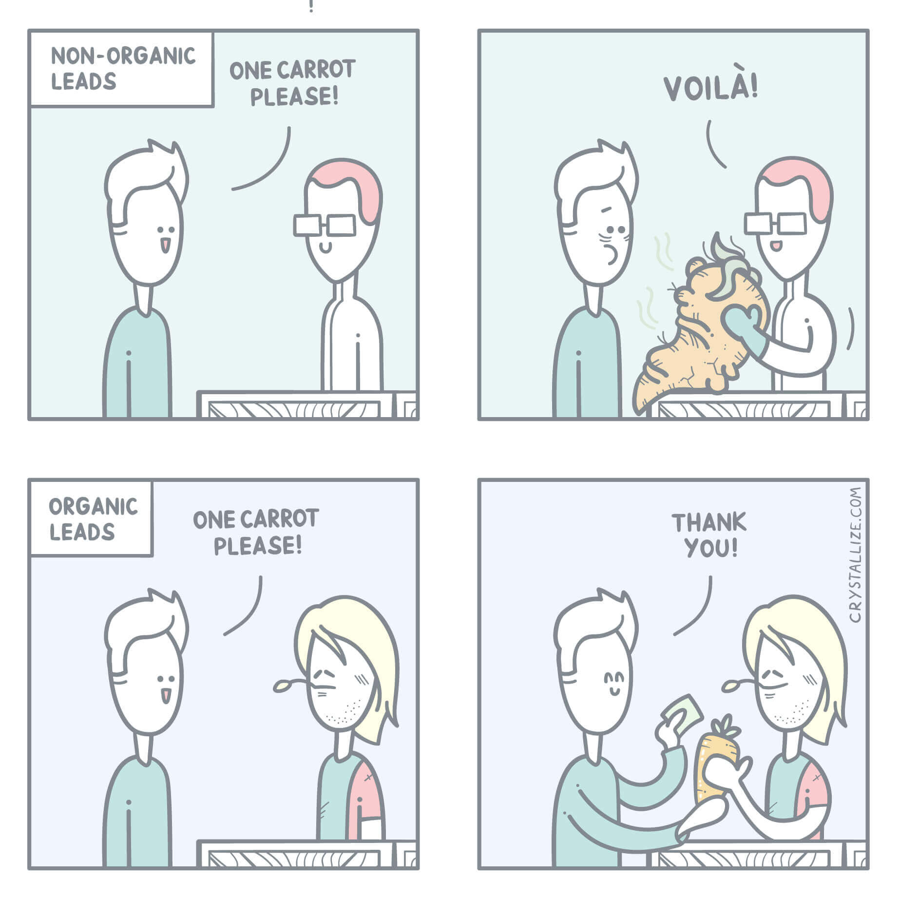
How to Use Hyperlinks Properly?
Psst: we are hiring remote frontend developers and backend developers.

A well-structured document with proper use of links enriches the user experience, provides better accessibility, and is also great for SEO. It makes the web richer. The link label should be as semantic as possible. Describe what you are linking to. Hyperlink text that is meaningful and descriptive.
TLDR: stop using click here and read more as link labels.

Hyperlinks in Hypertext Transferred with HTTP
Ever wondered what HTTP stands for? Hypertext transfer protocol. It is the foundation of the World Wide Web which is basically a bunch of HTML that are linked together using hyperlinks. That is the web as we all know it.
Hyperlinks are magic in hypertext. The phrase hypertext and hypermedia were coined by Ted Nelson back in the 1950s and Tim Berners-Lee is known for putting it all together as the World Wide Web back in 1989.
A hyperlink is a link label that a user can click on to open another document. Traditionally this is visualized with blue underlined text in HTML. Internet magic.
- HTTP: Hypertext Transfer Protocol
- Hypertext: Text that contains hyperlinks
- HTML: Hypertext Markup Language
- Hyperlinks: A reference to information that a user can click or tap.
[newsletter]Sign up for Crystallize newsletter!
Learn, build and grow your headless commerce with tips and tricks delivered to your inbox!
Better User Experience with Semantic Link Labels
Users are often scanning text on the internet looking for specific information. Headers, bullet lists, and hyperlinks are what stand out and grab the user’s attention first. Use links as intended, and you get a better user experience.
For example, if you are writing about headless commerce or on-demand streaming, make sure you link the key phrases so that the user knows a click on that link will lead him to more information on that specific subject.
Do not use phrases like click here for more information. Or slap a read more link at the bottom of your text since it does not provide a good user experience. What does here mean anyway?
Consider this as an example: Click here to sign up to Crystallize. Compared to: Sign up to Crystallize for FREE.
Accessibility or A11y Using Hyperlinks
The way you use links is essential for web accessibility. Consider that a screen reader will read your text. Your links should make sense out of context. Click here, more, and read more are examples of links that make no sense out of context. Screen readers typically say link followed by the link label. link: click here makes little sense compared to the phrase link: Sign up to Crystallize for FREE.
Consider the front page of a newspaper site with several articles followed by a link text that says Read more. A screen reader will then read link: Read more, link: Read more, link: Read more. Annoying, right? That would be an example of an awful user experience when accessing your site using a screen reader.
Name your link labels so they make sense out of context.